Website Design Case Study
Vector BioMed
A complete redesign and rebuild of Vector BioMed’s website to improve clarity, credibility, and user engagement.
About the Client
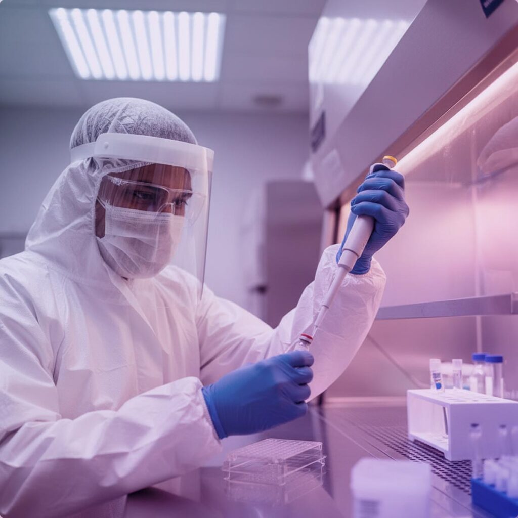
Vector BioMed is a biotech company focused entirely on lentiviral vector development and manufacturing. Their goal is to make cell and gene therapy more accessible by providing high quality, scalable vector solutions without the usual industry hurdles. With a growing platform and a newly developing identity, the team needed a website that clearly communicated what makes them unique and why their work matters.
Goals
Vector BioMed needed a modern and accessible website that clearly communicated their scientific expertise. I guided the project from research and strategy through design and WordPress development, creating a streamlined structure, a cohesive design system and an engaging user experience.
Tools I Used
- Google Analytics
- Semrush
- Figma
- Photoshop
- Illustrator
- WordPress
- Elementor
Analyzing the Existing Website
I started by reviewing the current website using analytics tools and accessibility tests.
What I found
01
Most users were visiting on desktop, though mobile still made up a meaningful portion.
02
Average engagement time was roughly 43 seconds, indicating users were leaving quickly.
03
The color contrast did not meet accessibility standards, which made the site difficult to use for many visitors.
04
The content lacked structure and hierarchy, so users often struggled to find key information.
Conclusion
Findings confirmed that the new website needed stronger content organization, a cleaner user journey and a more accessible, trustworthy visual design.
Researching the Industry and Competitors
To understand what users in this field expect, I reviewed websites from competitors such as Miltenyi Biotec, Oxford BioMedica and Lonza.
Key Insights
01
Competitors often used data and statistics to immediately communicate credibility
02
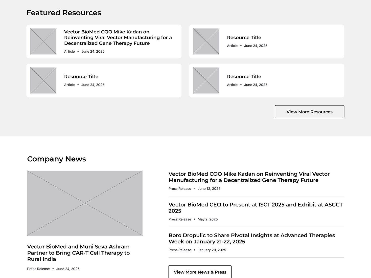
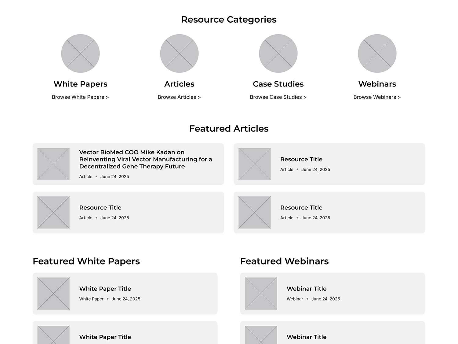
Many had extensive resource libraries containing articles, publications, webinars and industry insights.
03
Their site structures made it easy for users to explore services, learn more and take action.
04
Public analytics showed that sites with more educational content tended to keep users engaged longer.
Conversion Goals
The primary conversion was a simple contact form. Secondary goals included resource engagement and event participation.
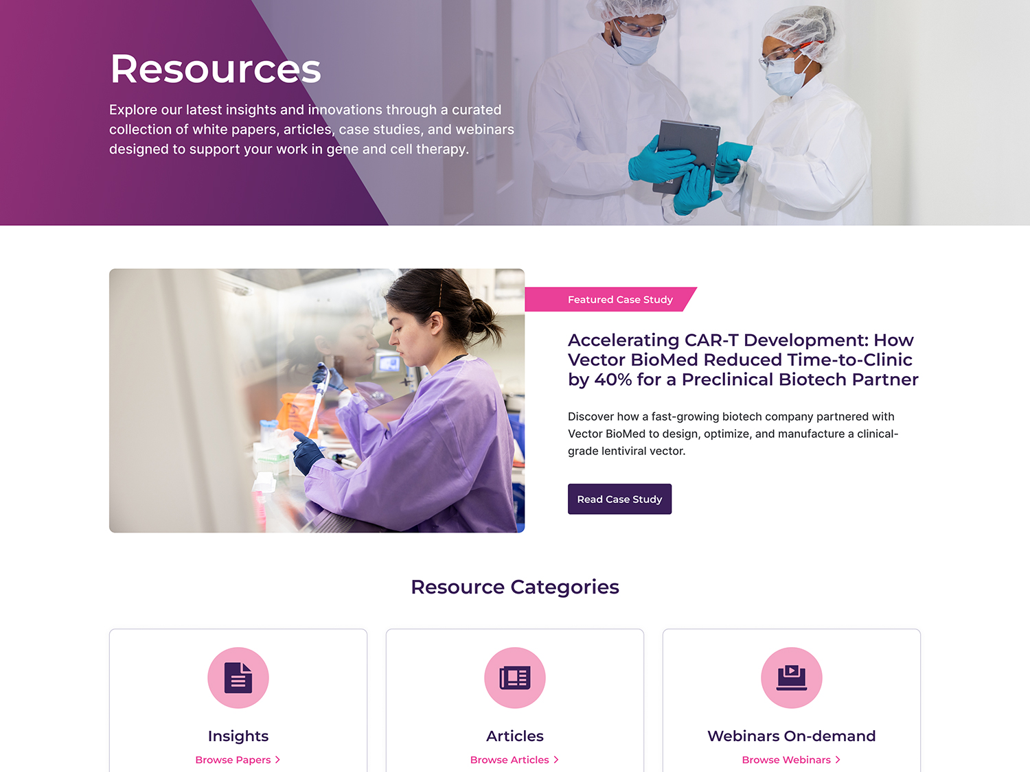
Sitemap Strategy
With goals and content direction in place, I reorganized the site into five main sections that were simple, clear and scalable.
- Services
- About
- Resources
- Events
- Contact
Each section was designed to help users quickly understand what Vector BioMed does, why it matters and how they can connect with the team.
Collaborating on Messaging
Working closely with the Vector BioMed team, I helped identify what content mattered most and how it should be presented.
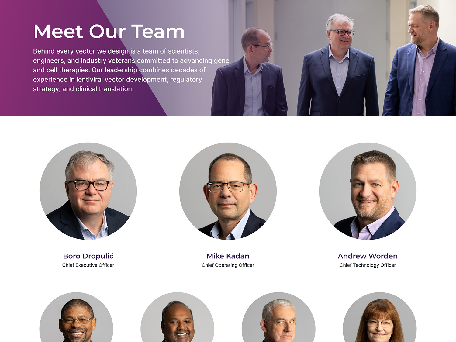
Content Priorities
01
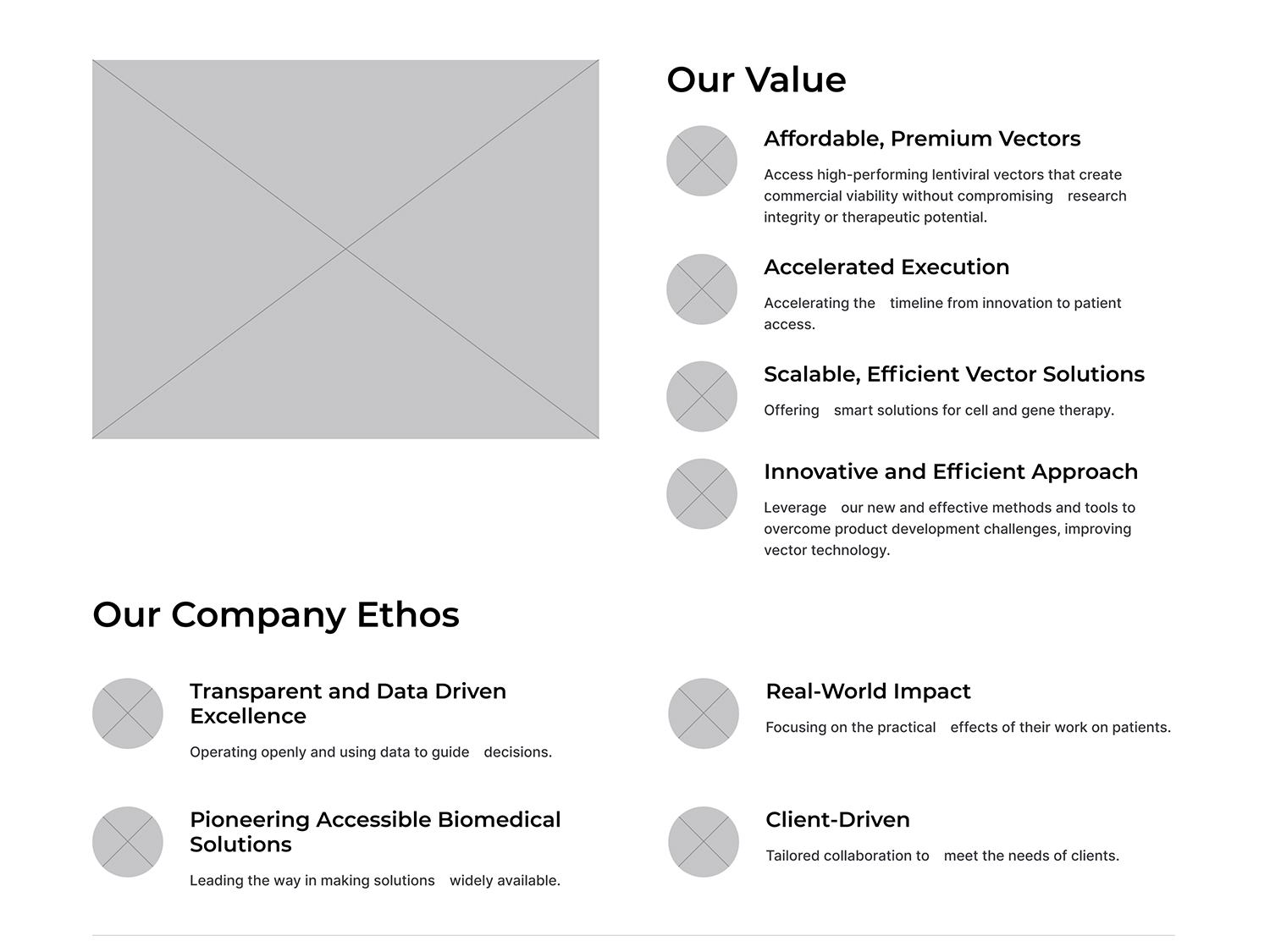
Highlight the team’s scientific expertise and focus on lentiviral vectors.
02
Provide clear explanations of workflows, capabilities and processes.
03
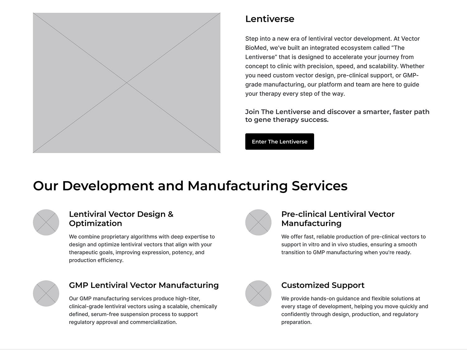
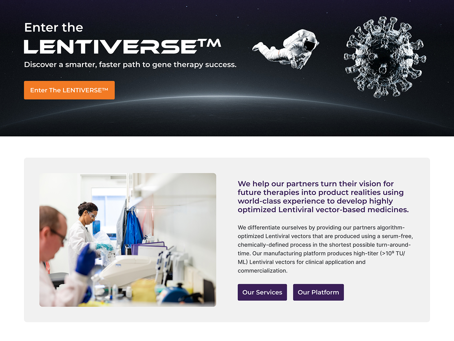
Introduce the LENTIVERSE service ecosystem in a way that was approachable and easy to understand.
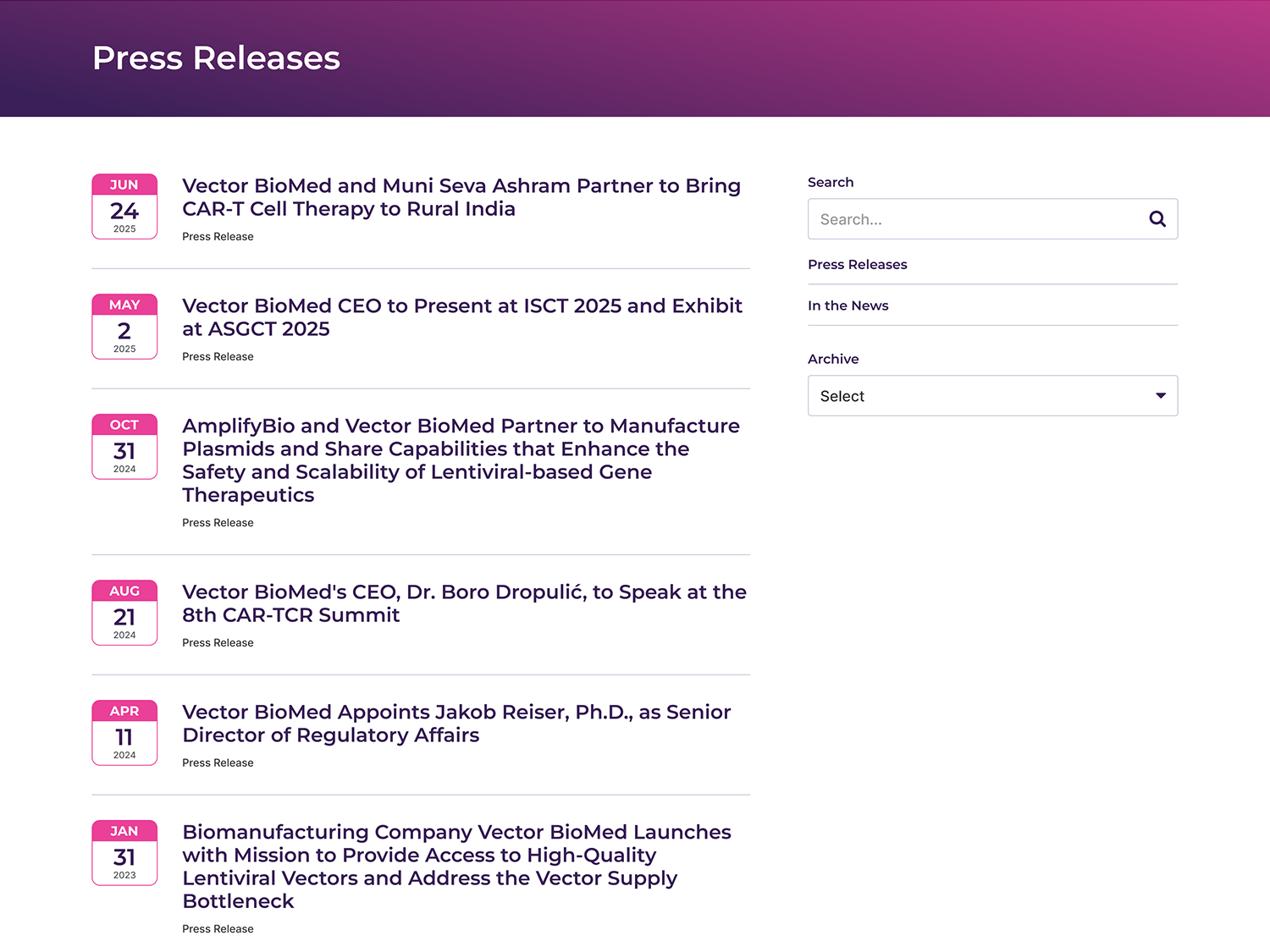
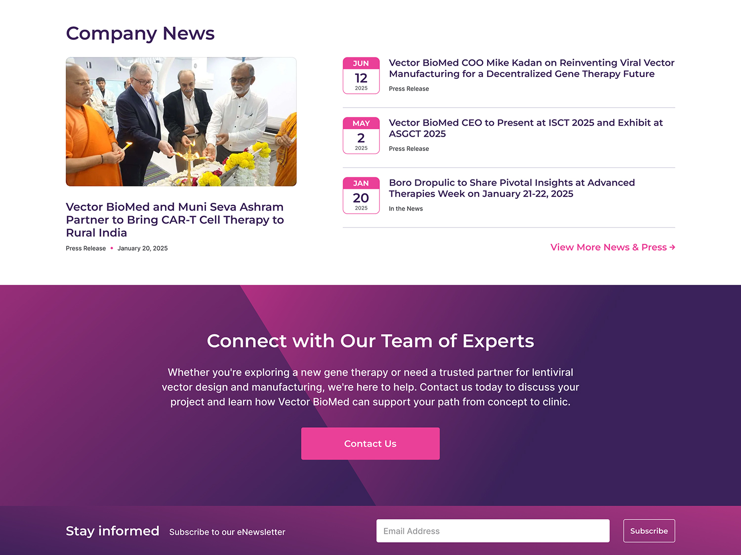
04
Offer supporting content including resources, news updates and events.
Wireframing the New Experience
I created low fidelity wireframes in Figma to map out how users would move through key pages.
Wireframe Focus Areas
01
Clear navigation through the header, footer and internal links.
02
A consistent concluding statement and call to action before the footer on every page.
03
Logical content order that guided the user from broad understanding to specific details.
04
Flexible layouts that allowed for easy iteration during review.
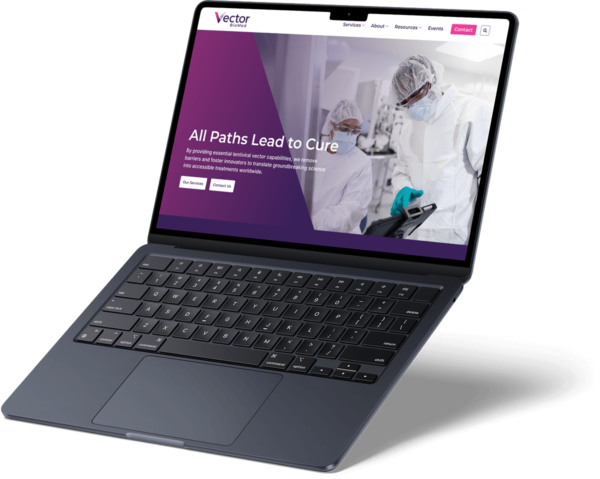
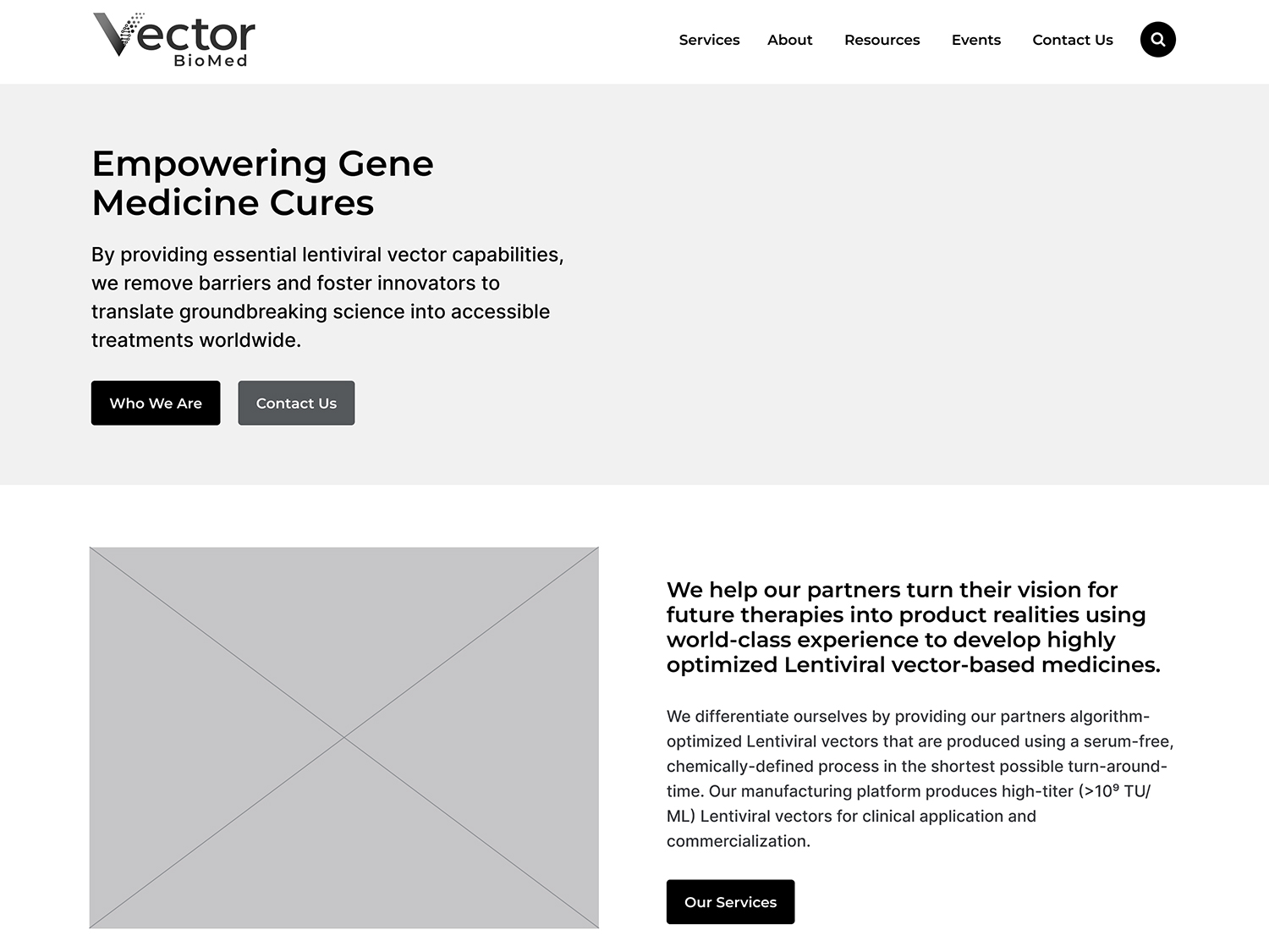
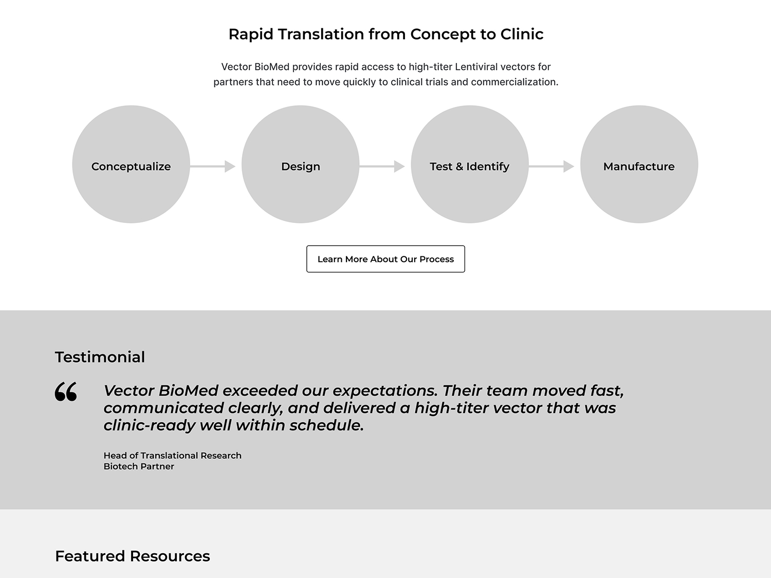
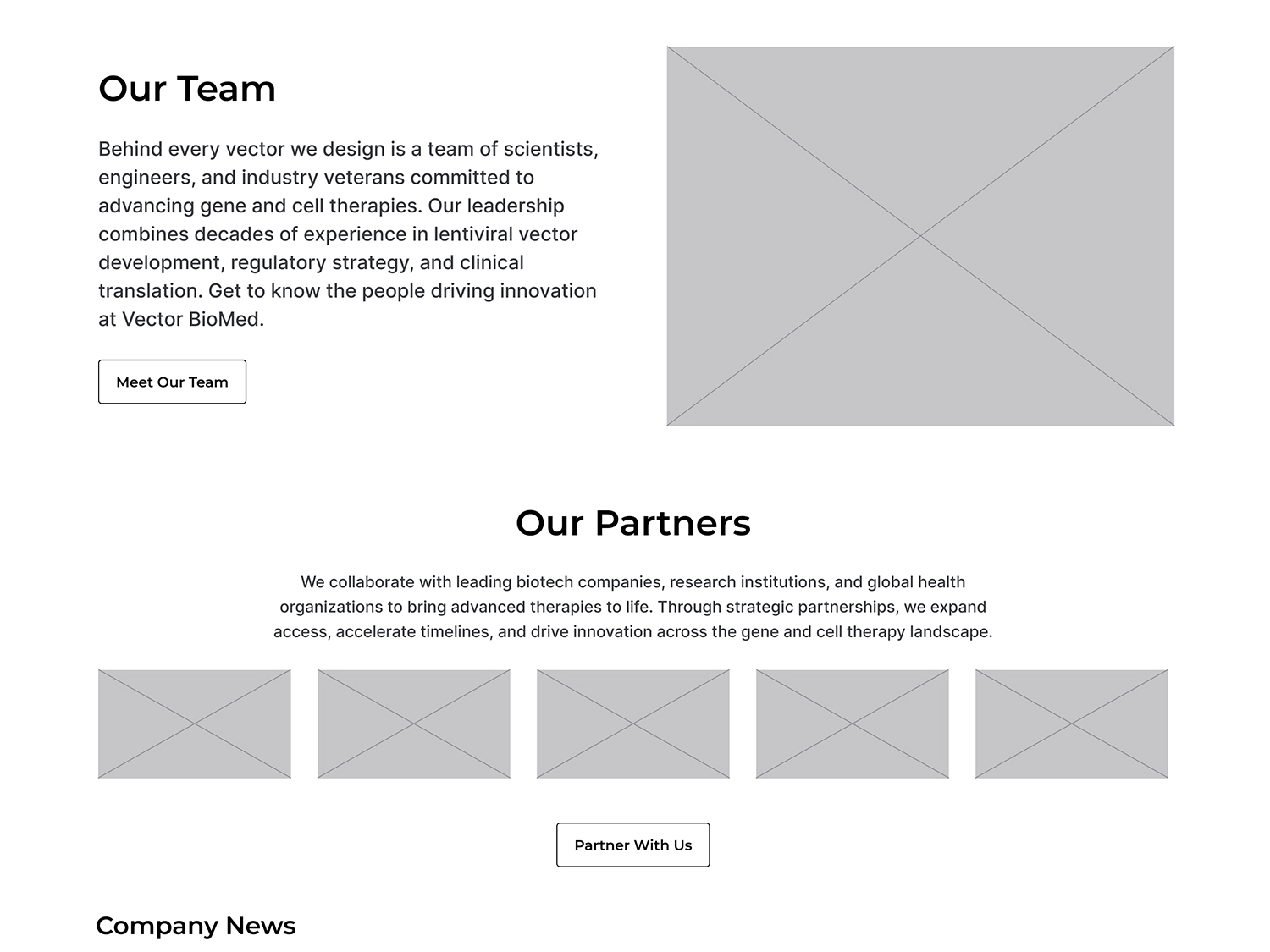
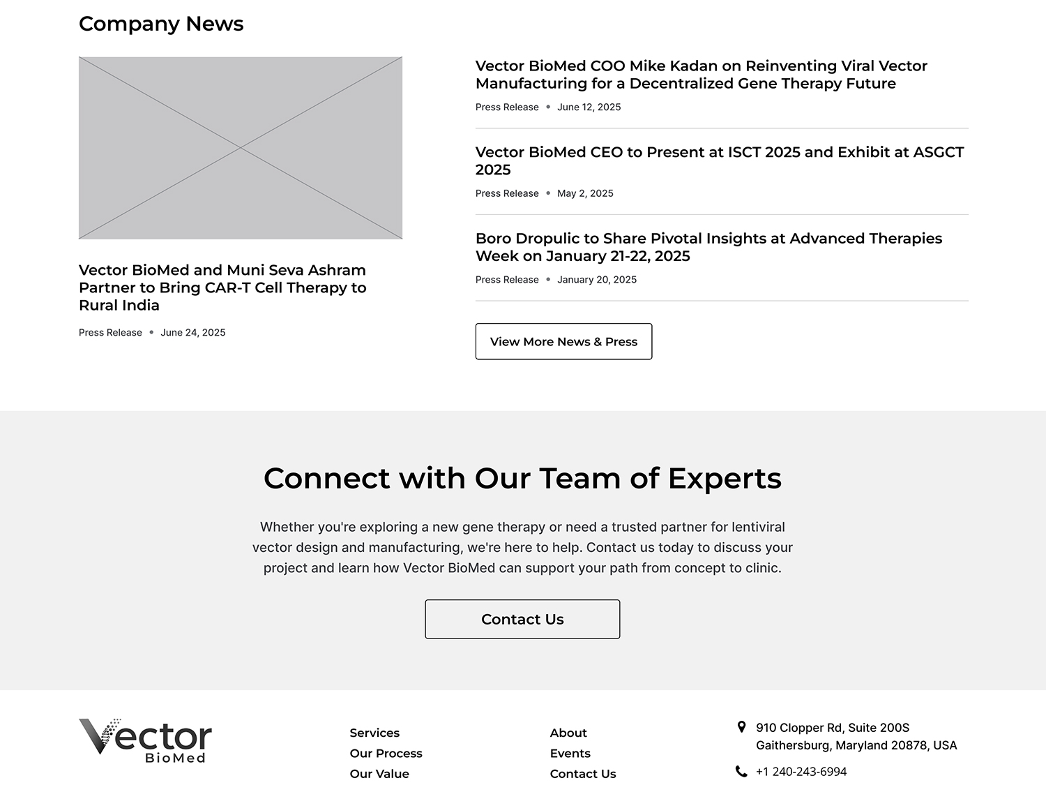
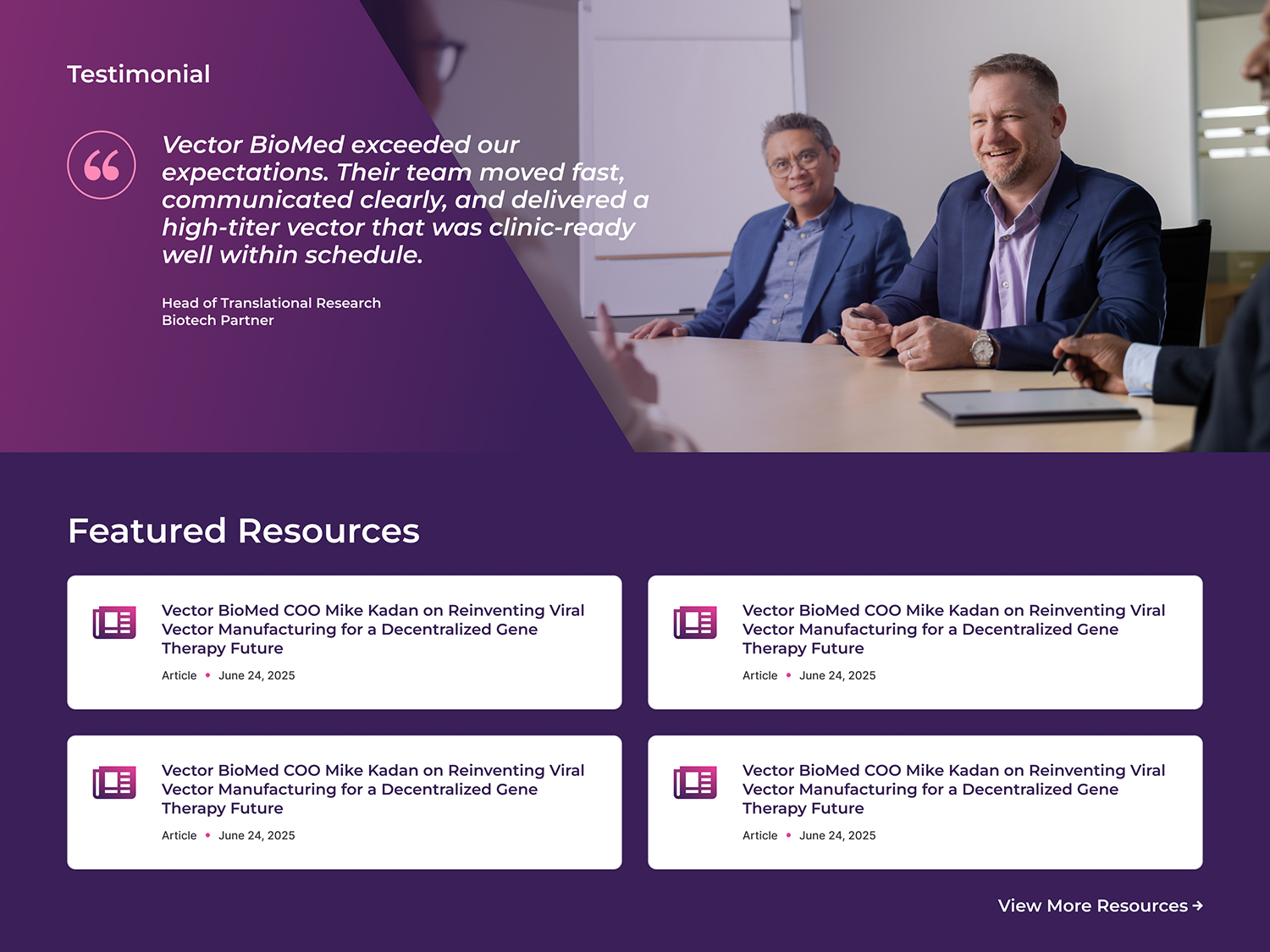
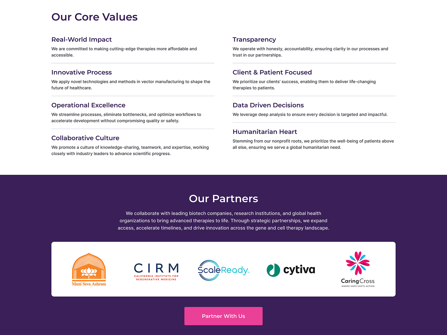
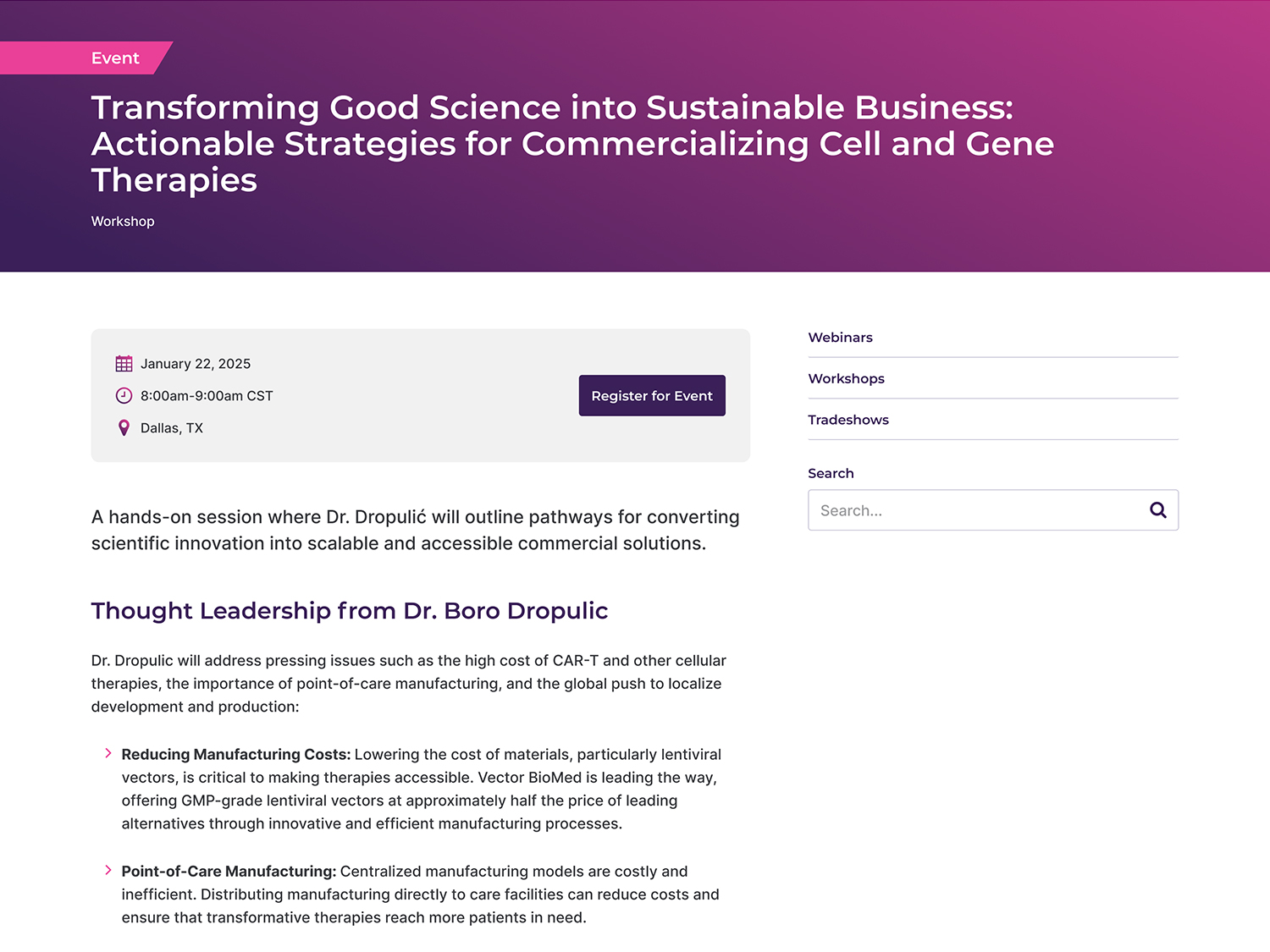
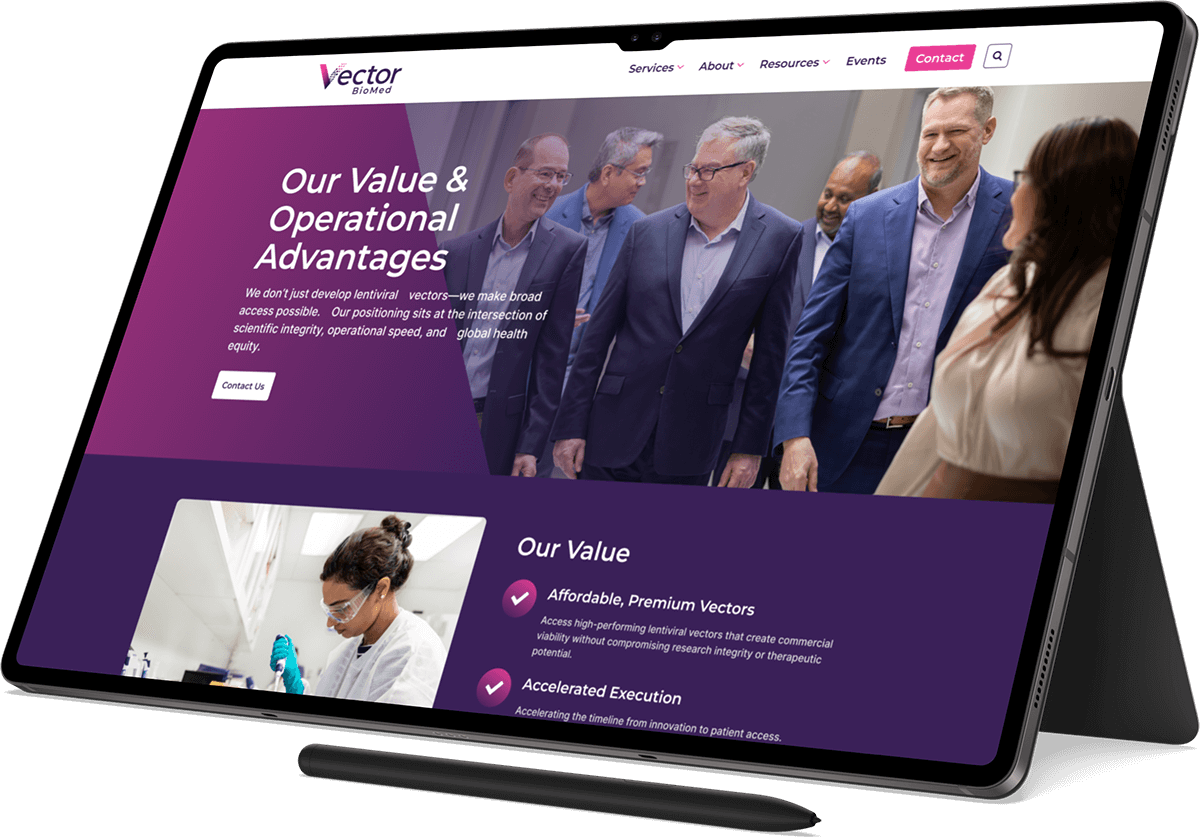
Designing High Fidelity Mockups
Using the design system and approved wireframes, I built out high fidelity mockups of the homepage, key landing pages, archives and detail templates.
Design Strategy
01
Pages followed consistent layout patterns so users never had to guess how to navigate.
02
Important content and CTAs were highlighted using simple but effective visual cues.
03
Whitespace, spacing and typography were used to make scientific content easier to digest.
04
Color and contrast were carefully managed to remain accessible without sacrificing visual appeal.
Design System Included:
- An accessible and scientifically appropriate color palette.
- Readable, professional typography that worked well across screen sizes.
- Reusable components such as buttons, cards and feature blocks.
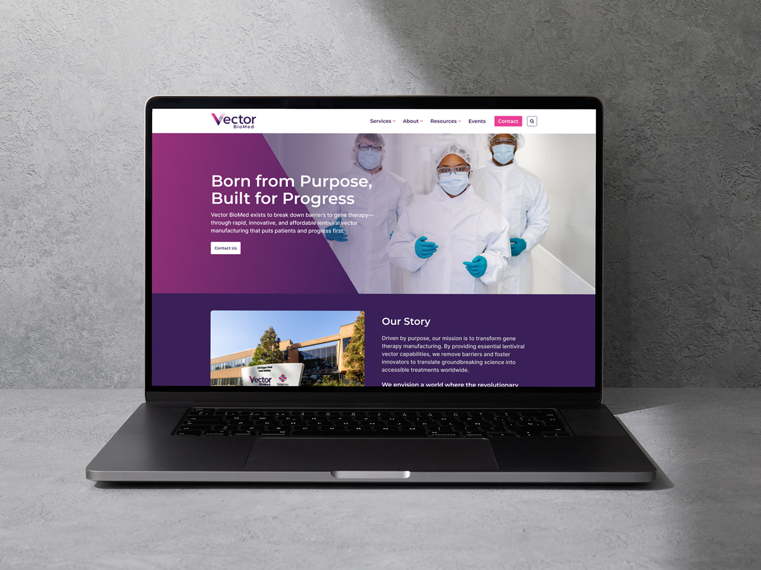
Developing the Website in WordPress
I built the website using WordPress, combining Elementor for page structure with Gutenberg for article, event and resource content. This created a flexible backend that the Vector BioMed team could maintain easily.
Development Highlights
01
Reusable templates were created for the majority of pages to reduce development time and maintain consistency.
02
Yoast SEO was implemented to improve metadata control and help boost search visibility.
03
Custom HTML, CSS and JavaScript were added in areas where Elementor could not meet the intended design.
04
The site was built with performance, accessibility and responsive behavior in mind.
Results
The finished website provided Vector BioMed with a modern, trustworthy and user friendly digital presence that aligned with their mission and scientific expertise.
This project highlighted the value of combining research driven strategy with thoughtful UX and design systems. By grounding decisions in analytics, competitor insights and accessibility standards, the final product became not only visually compelling but also functional, educational and user centered.
Positive Outcomes
- Refined Navigation Structure
- Improved SEO Rankings
- Accessible, consistent use of color and typography
- User-friendly resource access system
- Flexible page structures
- Effective cross-linking to encourage user-flow and conversions