Website Design Case Study
Crossroads of War & Freedom
A comprehensive redesign of a Civil War research and resources repository website to improve accessibility, discovery, and long-term scalability.
About the Client
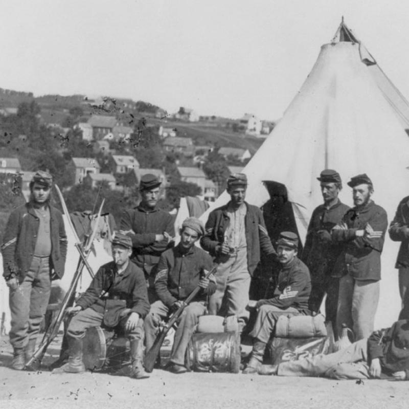
Crossroads of War & Freedom is a digital humanities initiative dedicated to documenting the Civil War era in the border states region through essays, primary source research, and multimedia resources. The site serves as a public-facing historical archive, offering access to newspapers, firsthand accounts, soldier biographies, historic places, and media that illuminate life before, during, and after the Civil War. A central focus of the project is elevating African American historical records that are often underrepresented in traditional archives.
Goals
The primary goal of the project was to modernize the Crossroads of War & Freedom website without compromising its scholarly depth or public accessibility. As the library continued to grow, the existing website struggled to support new content categories, modern accessibility standards, and contemporary user expectations. The project required a thoughtful redesign that balanced academic rigor with usability.
Tools I Used
- Google Analytics
- Semrush
- Figma
- Photoshop
- Illustrator
- WordPress
- Elementor
Analyzing the Existing Website
I began by auditing the current Crossroads of War & Freedom website, focusing on content structure, accessibility, usability, and SEO fundamentals.
What I found
01
The site was not mobile-friendly and relied on outdated layout patterns.
02
Color contrast in several areas failed to meet Section 508 accessibility standards.
03
Navigation paths were unclear, and some content was inaccessible through primary navigation.
04
Content lacked clear hierarchy, making it difficult for users to understand how stories, research, and media related to one another.
Conclusion
The analysis confirmed that the site needed a stronger structural foundation, simplified navigation, and a more accessible design system to support its growing archive.
Researching Comparable Historical Archives
To better understand best practices for large-scale historical libraries, I studied several established Civil War and historical research websites, including The Valley of the Shadow, the Virginia Museum of History & Culture, and the Gilder Lehrman Institute of American History.
Key Insights
01
Successful archives used clear category-based navigation to reduce cognitive load.
02
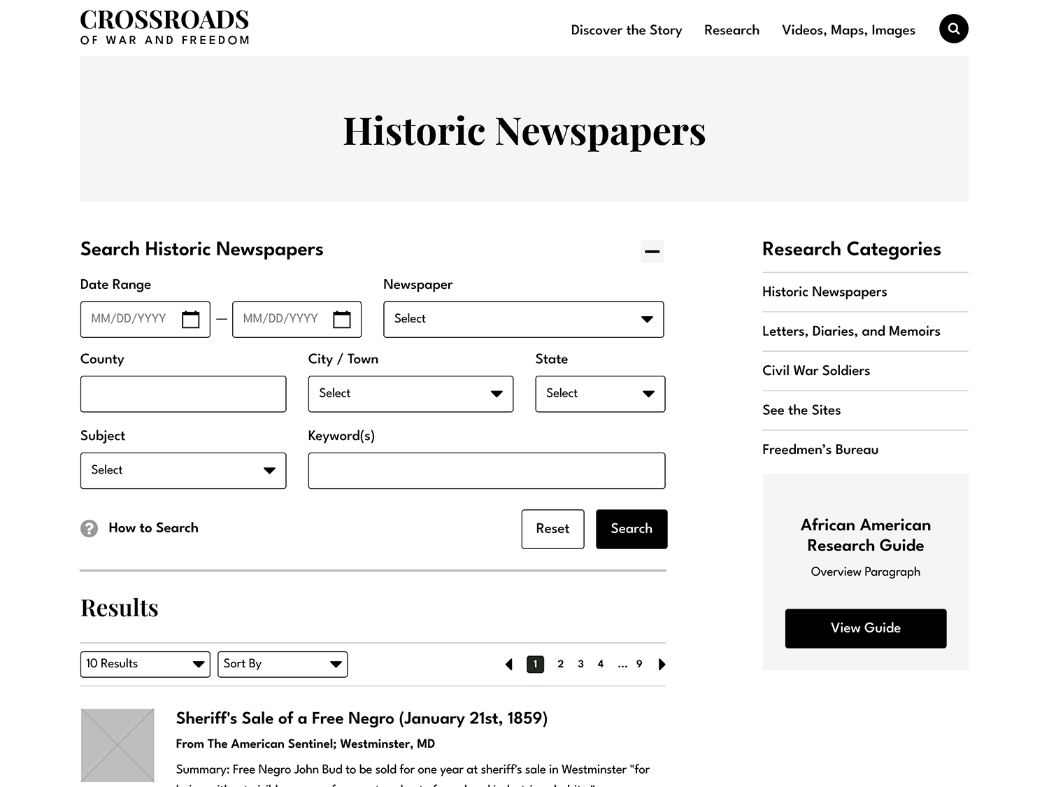
Advanced filtering and search tools were essential for deep research collections.
03
Text paired with photography or media helped contextualize historical information.
04
Simplified navigation structures guided users without overwhelming them.
Conversion Goals
Publicly available analytics suggested that sites with clear content segmentation and discovery tools supported longer engagement and deeper exploration.
Sitemap Strategy
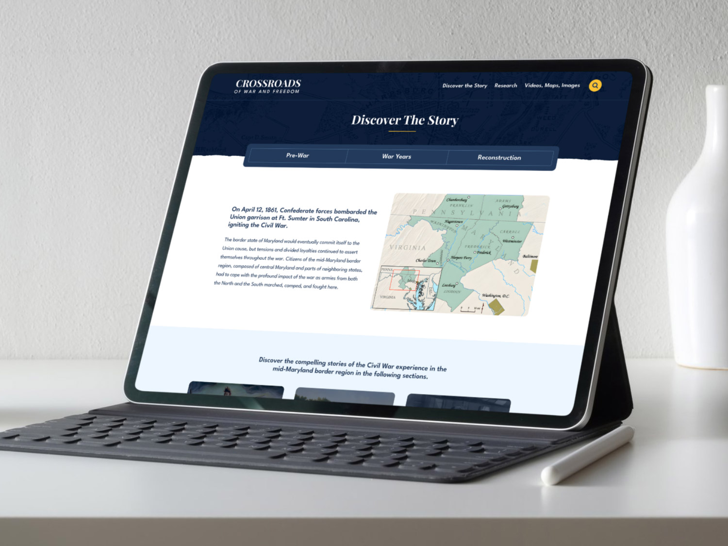
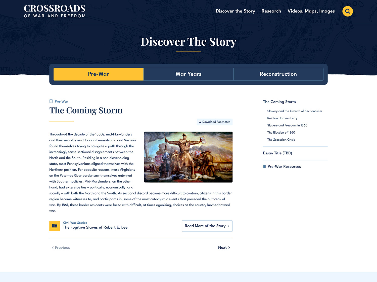
With content priorities established, I created a sitemap designed to be clear, scalable, and intuitive.
- Discovery The Story
- Pre-War
- War Years
- Reconstruction
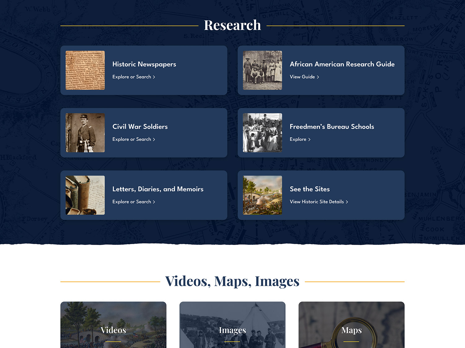
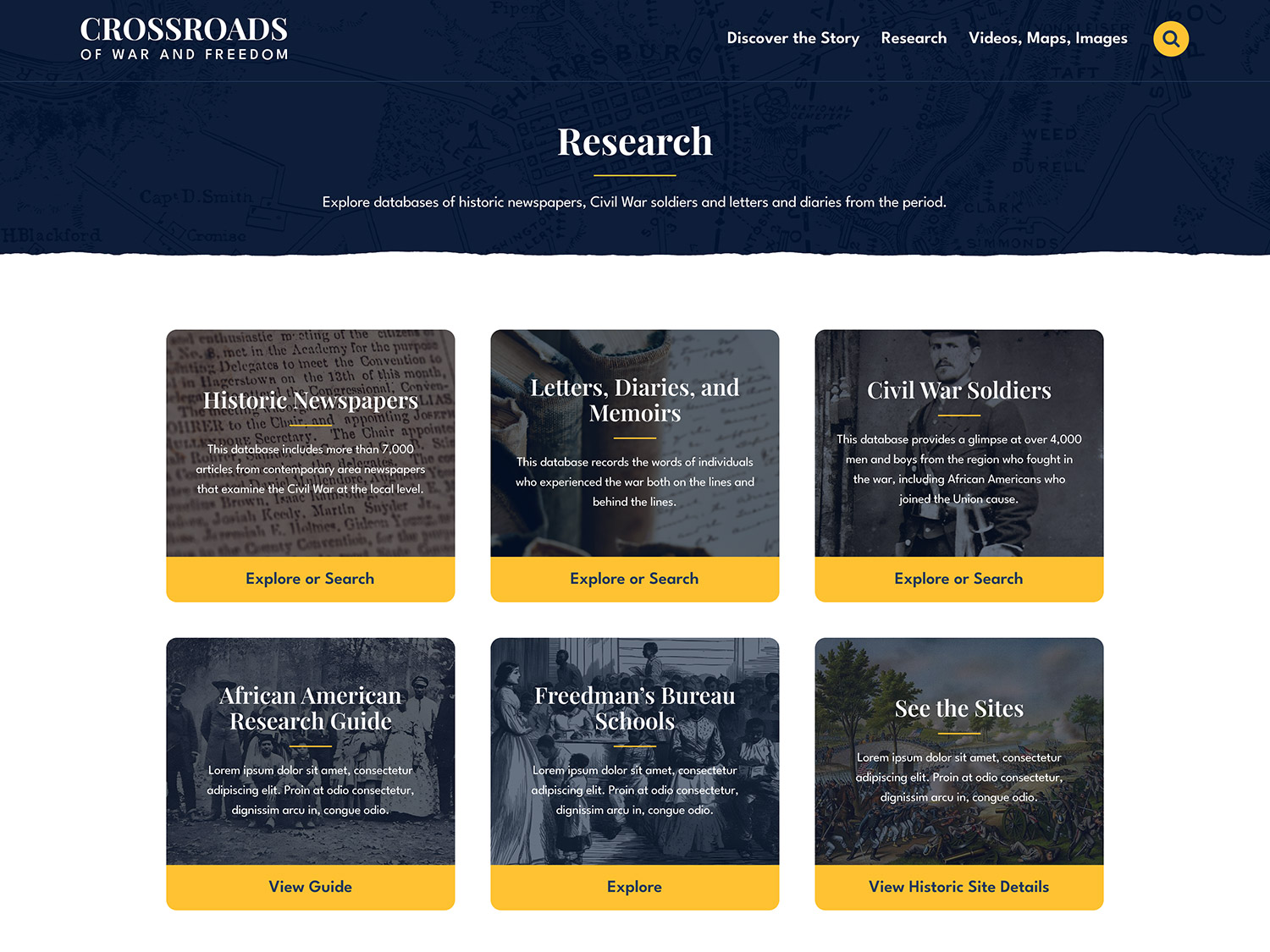
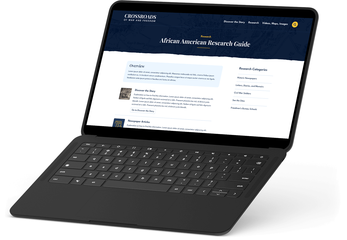
- Research
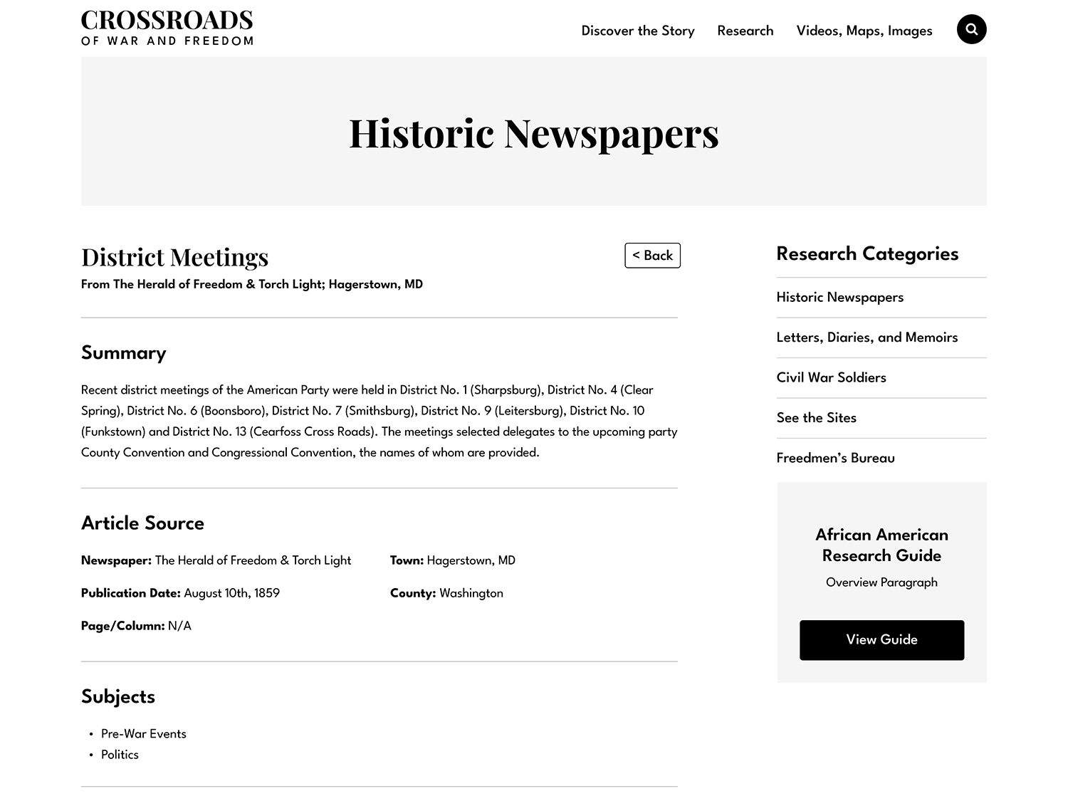
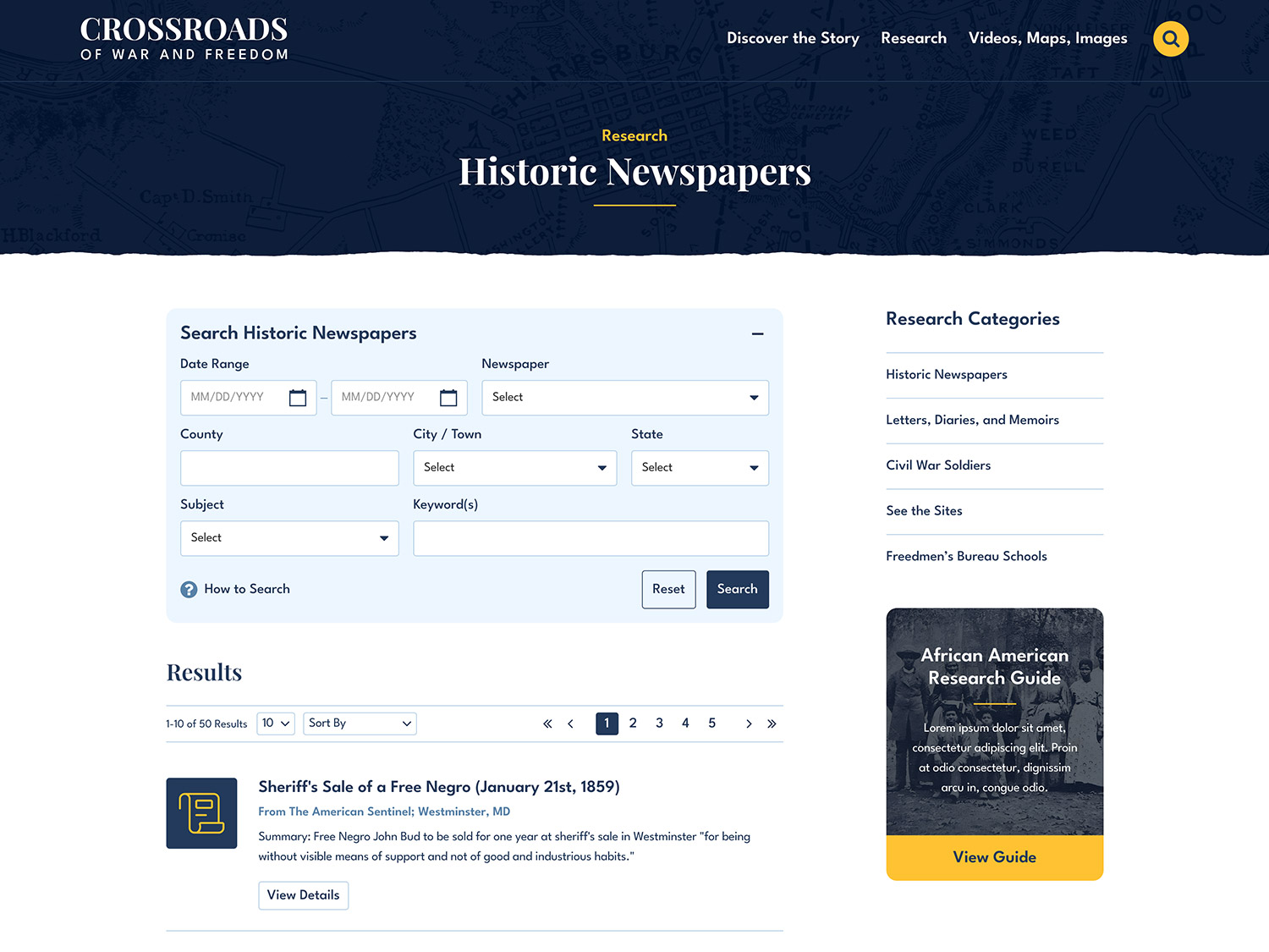
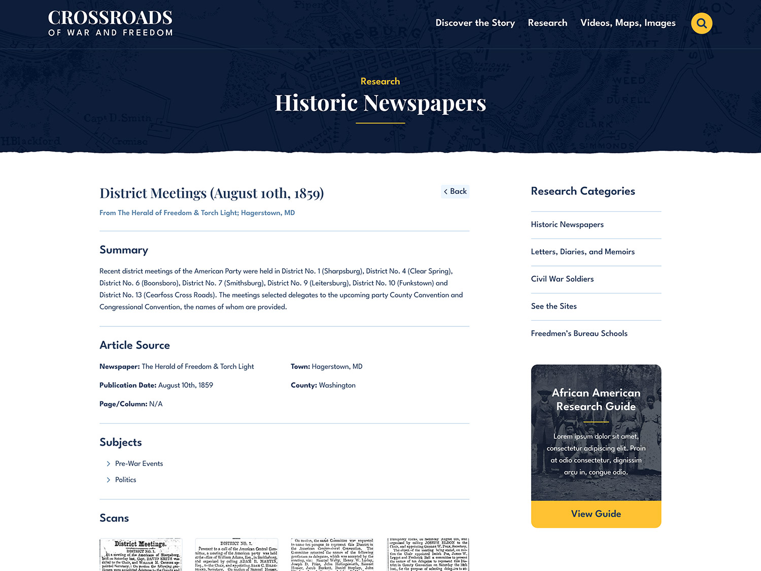
- Historic Newspapers
- Firsthand Accounts
- Civil War Soldiers
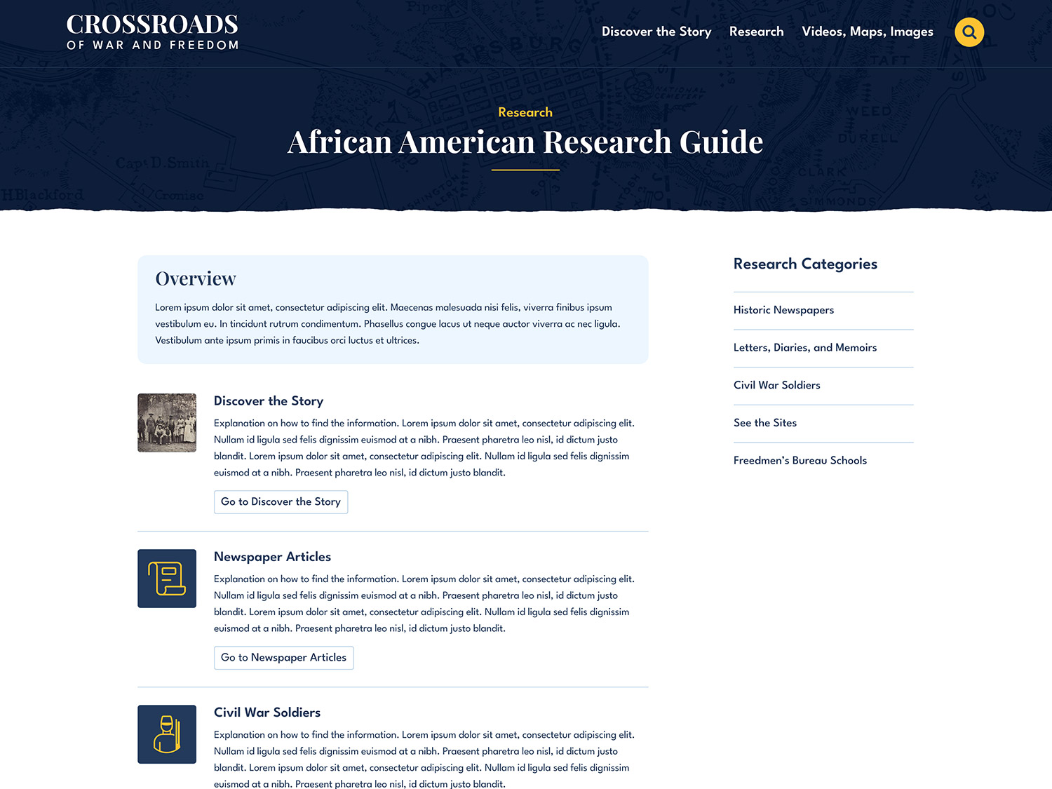
- African American Research Guide
- Freedmen’s Bureau Schools
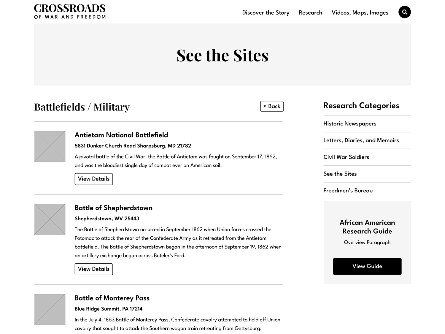
- Historic Places
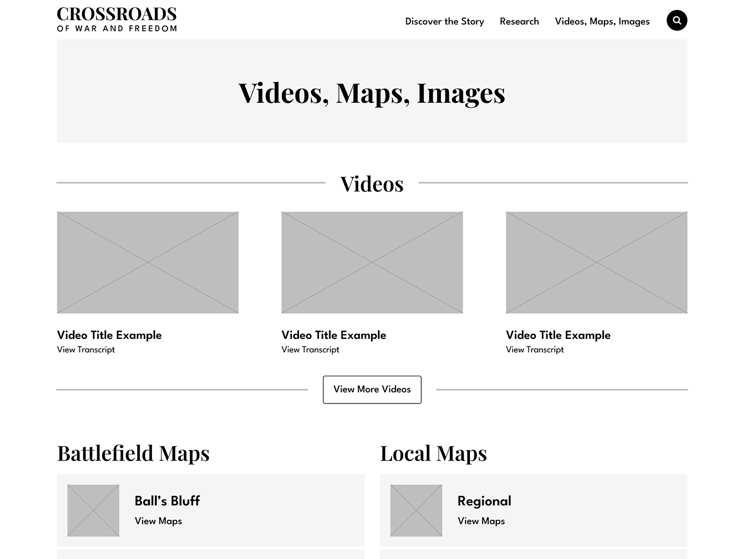
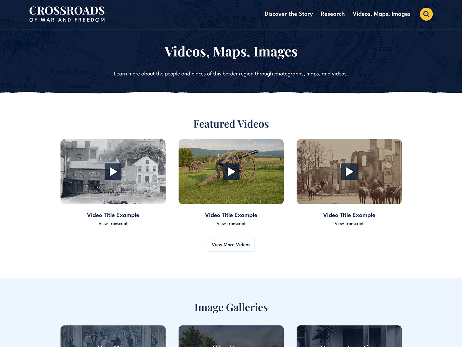
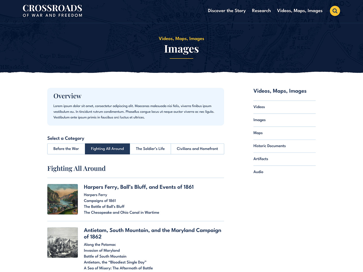
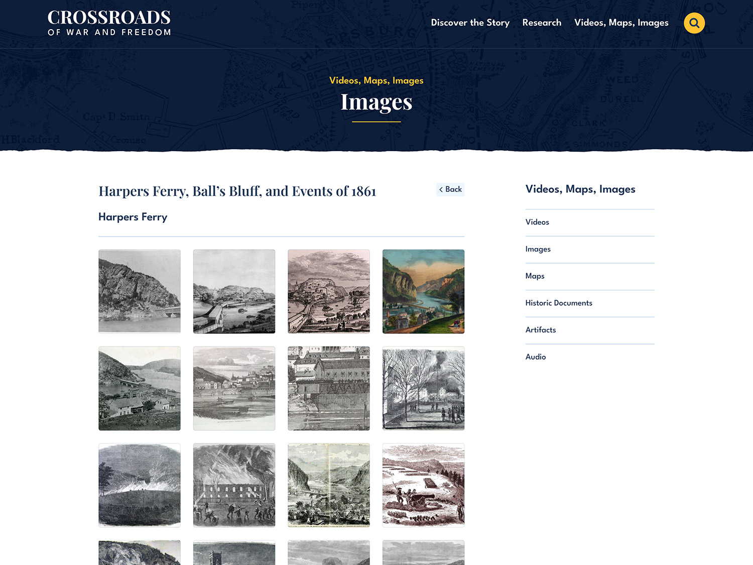
- Images, Maps, Videos
- Image Galleries
- Maps
- Videos
- Historic Documents
- Artifacts
- Audio
Defining Content Structure
I worked closely with the client to clarify how content should be grouped and how users should move through the site.
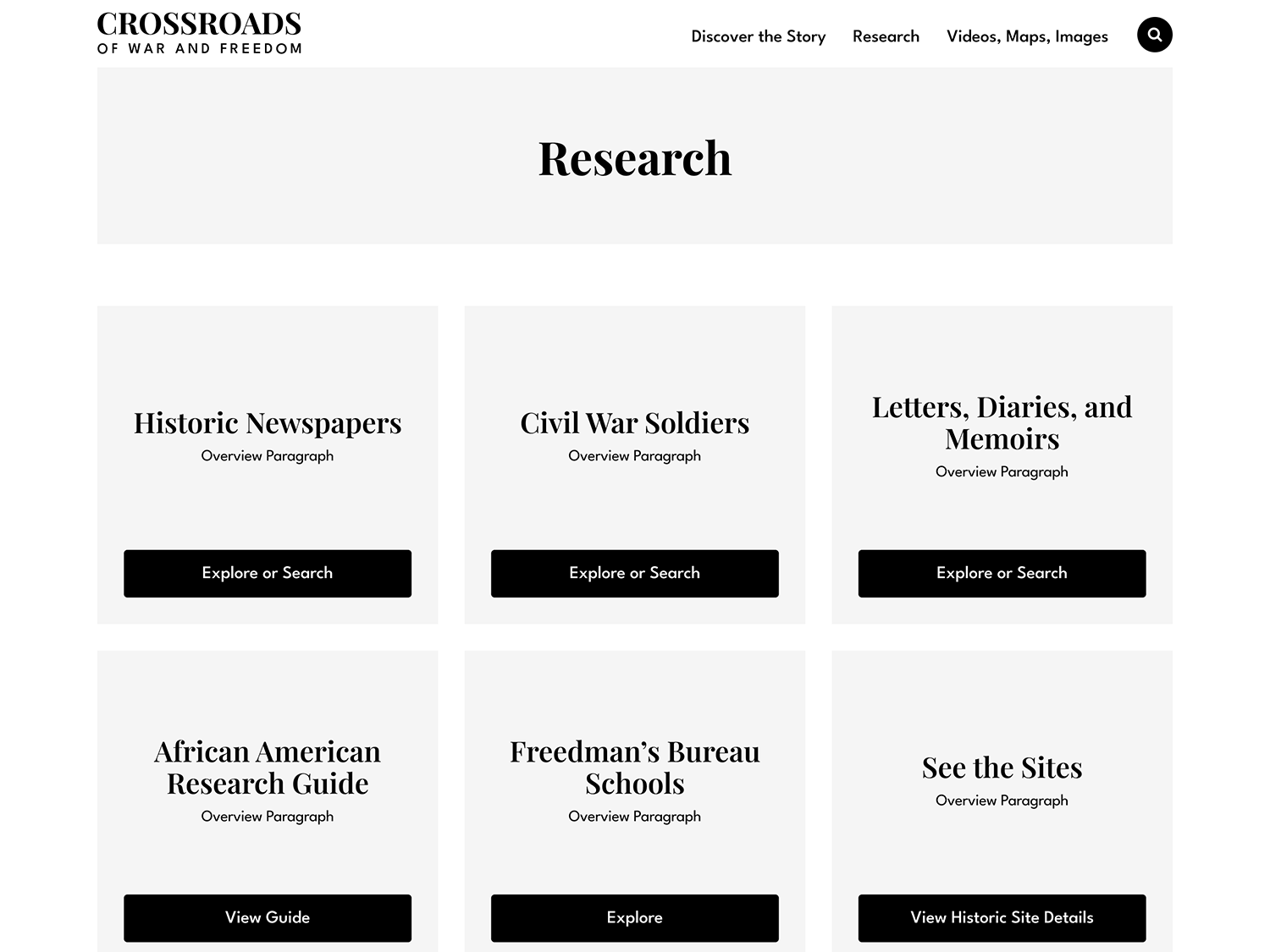
Content Focus Areas and Conversion Goals
01
Civil War Stories: Essays exploring life before the war, wartime experiences, and Reconstruction
02
Media Resources: Image galleries, maps, videos, documents, artifacts, and audio recordings
03
Research: Databases of newspapers, firsthand accounts, soldiers, historic places, and an African American research guide
04
The primary conversion goals centered on resource accessibility and encouraging visitors to sign up for email updates. A secondary goal was to acknowledge supporters through a dedicated credits section.
Wireframing the User Experience
Low fidelity wireframes were created in Figma to define content order, navigation behavior, and page-level hierarchy.
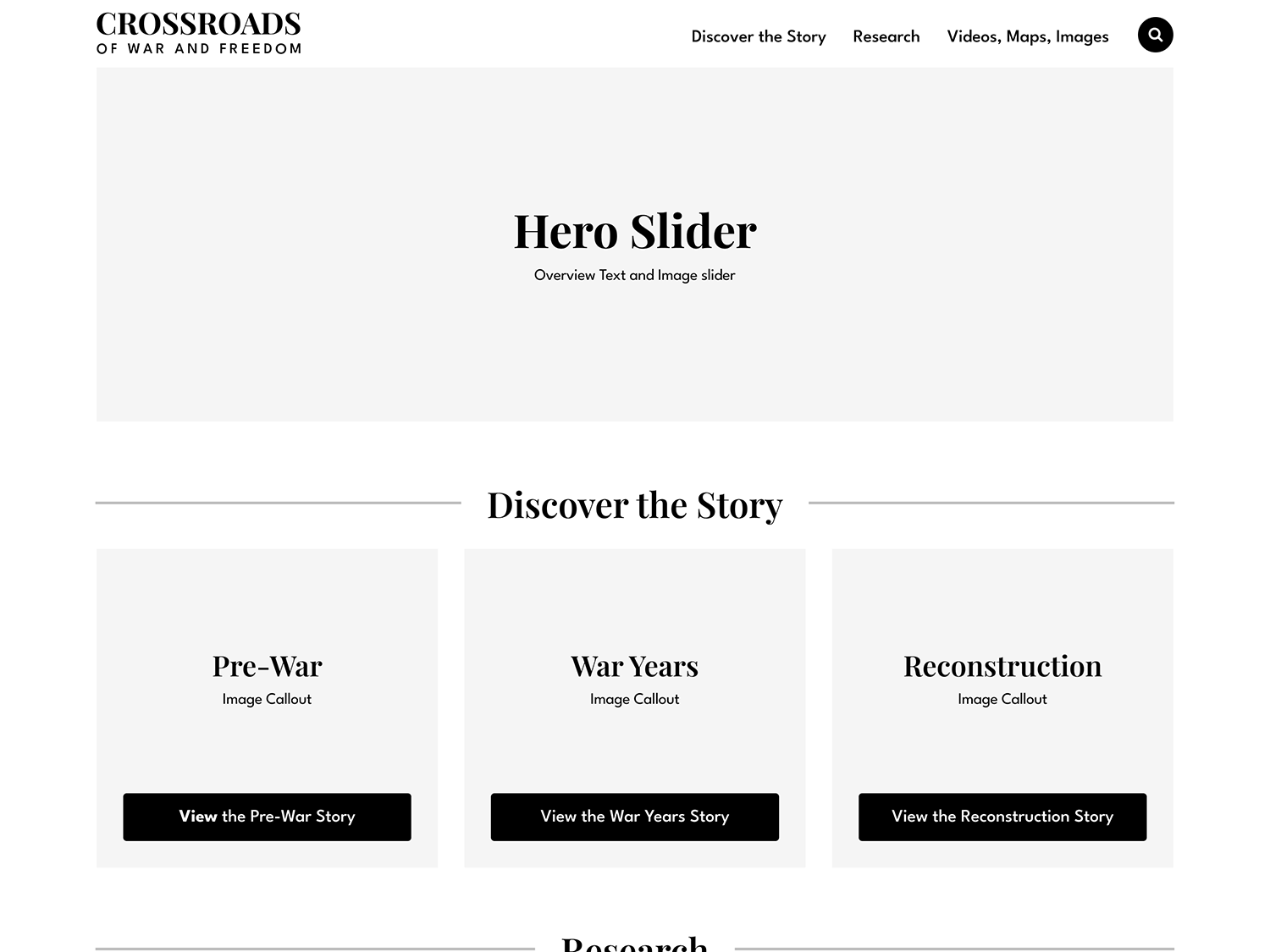
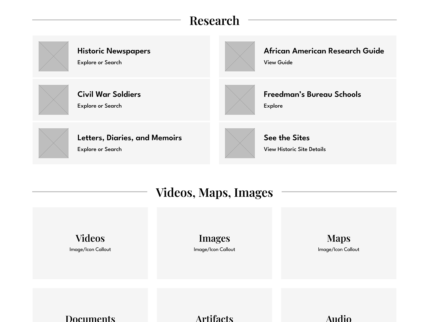
Wireframe Focus Areas
01
Establish consistent navigation through header, footer, and inline links.
02
Outline requirements for landing pages, archives, and detail views.
03
Define clear flow paths to encourage exploration across content types.
04
Validate content priorities before moving into visual design.
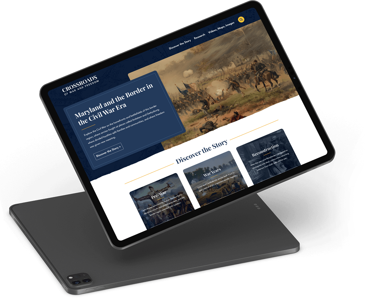
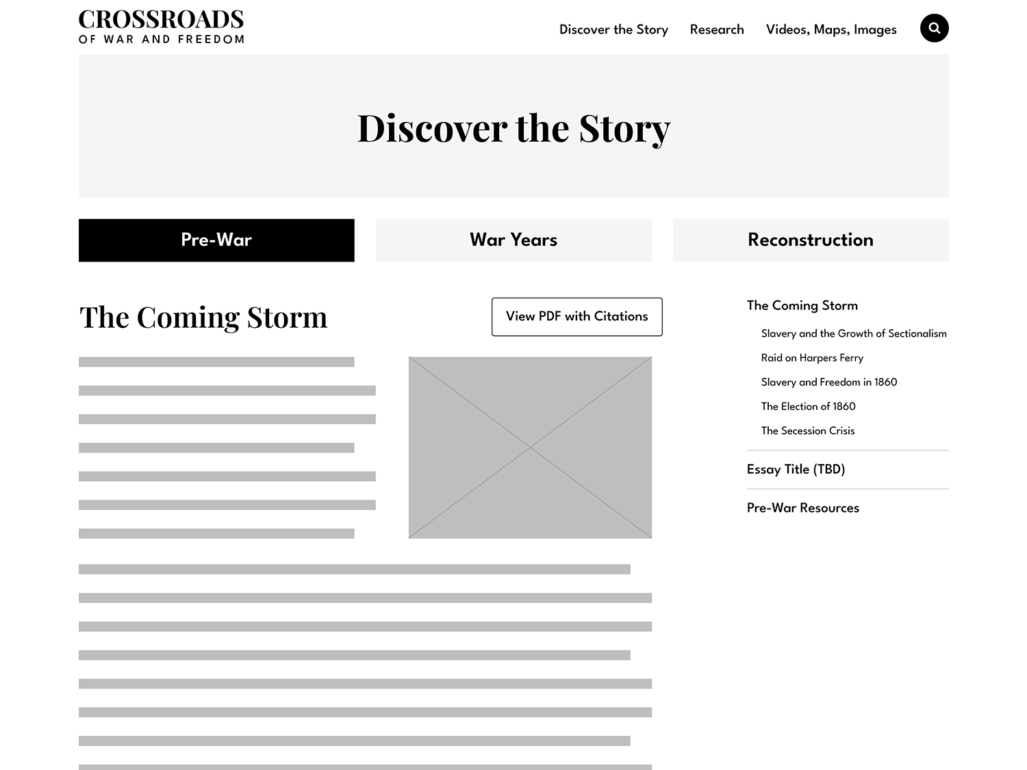
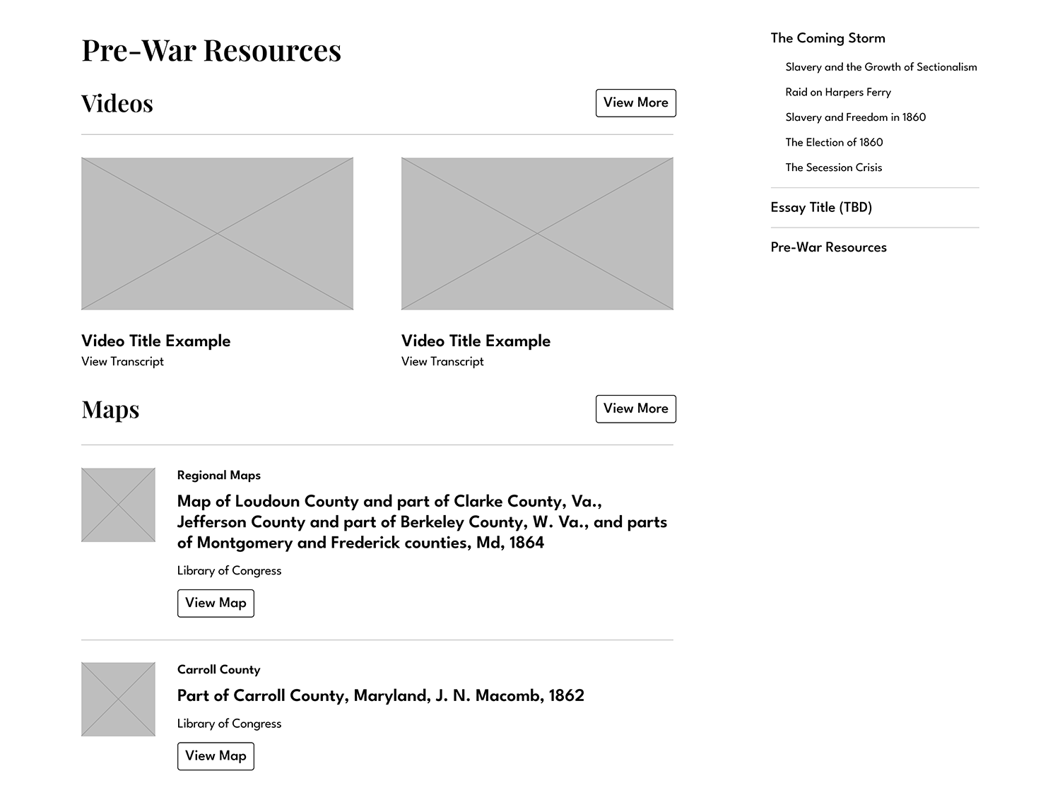
Designing High Fidelity Mockups
Using the approved wireframes, I designed key pages in Figma, beginning with a foundational design system. Research repository designs included advanced filtering structures and flexible detail page layouts capable of supporting multiple content types.
Design Strategy
01
A cohesive set of colors, typography, and UI components formed a flexible design ecosystem.
02
Highlight colors were reserved for high-importance elements such as navigation and featured content.
03
Layout patterns were reused across sections to create consistency and familiarity.
04
All color usage was evaluated against accessibility contrast requirements.
05
Designs were presented with a walkthrough of UX and content strategies.
06
Feedback was incorporated through iterative refinements.
Design System Included:
- An accessible color palette with a modern take on Civil War soldier uniform color tones.
- Readable, professional typography and photography strategies that worked well across screen sizes.
- Reusable components such as buttons, cards and feature blocks.
Developing the Website in WordPress
The website was developed using WordPress and Elementor. This created a flexible backend that could be easily maintained and expanded upon.
Development Highlights
01
Reusable templates were developed to minimize redundant development and simplify maintenance and expansion.
02
Performance, responsiveness, and accessibility were prioritized throughout development.
03
Custom HTML, CSS and JavaScript were added in areas where Elementor could not meet the intended design.
04
Essay layouts were carefully formatted to balance imagery and long-form content.
Results
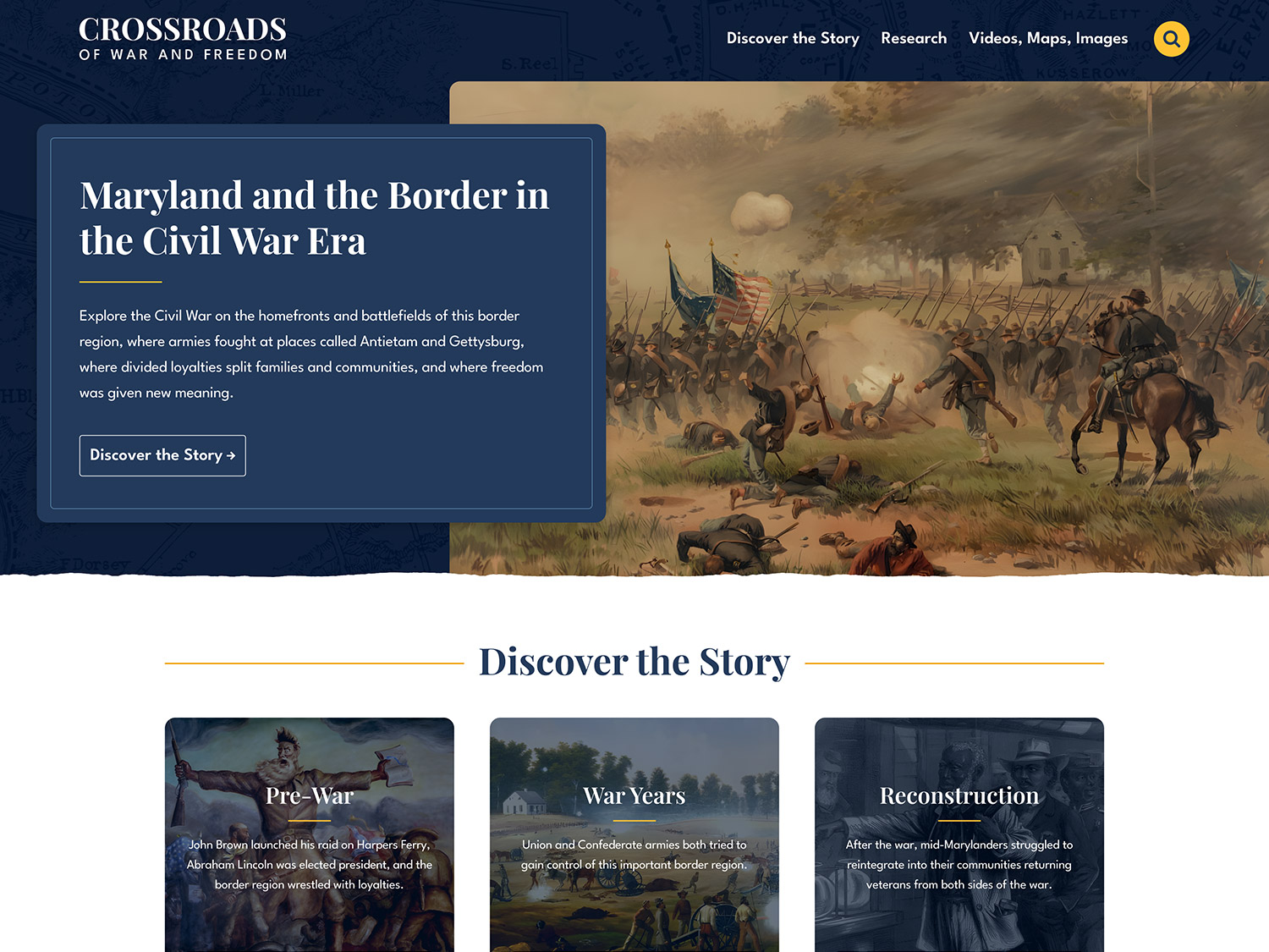
The redesigned Crossroads of War & Freedom website delivered a modern, accessible, and highly navigable digital archive that supports both scholarly research and public exploration.
This project demonstrates the importance of pairing research-driven strategy with thoughtful UX and system-based design, especially for content-rich, mission-driven organizations.
Positive Outcomes
- Significantly improved navigation and content discovery
- Accessible color and typography system compliant with contrast standards
- Clear segmentation of stories, research, and media resources
- Flexible infrastructure capable of supporting future content growth
- A visual experience that feels contemporary while respecting historical context